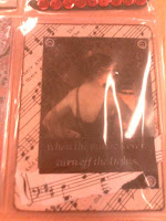
Mailbox full of colour
So I went to my dads and I was right a mailbox full of colour stuff for me!!! It was very exciting going through. 1st I looked at the postcards I got.
 This 1st one is from a Rupert Hoydell who lives in england but only put his name and a postcode on the back so not sure how I am going to bea bel to send him something back. Rupert if you come on here, post me a comment or email me your address please. Next we have another postcard from a Sean Whatever who lives in the U.S.A.
  The bottom half is an enlargement of a beautiful red and yellow flower which can be seen in small on the back of the postcard and the top half is like the word color has been cut off. I like it, we know what the word means even though it isn'
t all there and the bright colours of the flower are a reflection of the word.
I got a selection of postcards in an envelope from a Barend G van der gracht - I am glad he included a typed piece of paper with his address as I could not read his writing very well, a lovely scrawl, its looks nice but hard to understand. I liked the picture he had drawn on the front of the envelope as shown below.
These 3 postcards are what was included, he has made use of existing postcards and added to them or used them as a base. We got u like my colour - the aborigine is interesting and has some kind of tattoo's on his face which you don't see often in our culture. There's the girl where he had added some colour with crayon and then the man, where he has used an old postcard as a base, seems to have whited over it with paint or tipex (probably paint) and then created the man on top.


 Then by the same artist we have the hand seeming to draw the postcard - I like this concept, its like the picture is being drawn in front of you. Has a monty python feel to it where they use animation with real pictures.
Finally we have my favorite which is nothing against the other artists who sent in their work but I have been admiring Fabio's work online since I saw his entry to the Small Art Project on www.mailart.org and I feel priveleged that he sent a piece in to my call. I love the pop art feel his work has and I do like the space theme to this. The decoration on his enevelopes is great and I felt bad that I could not be more careful when opening them.

These 3 postcards are what was included, he has made use of existing postcards and added to them or used them as a base. We got u like my colour - the aborigine is interesting and has some kind of tattoo's on his face which you don't see often in our culture. There's the girl where he had added some colour with crayon and then the man, where he has used an old postcard as a base, seems to have whited over it with paint or tipex (probably paint) and then created the man on top.


 Then by the same artist we have the hand seeming to draw the postcard - I like this concept, its like the picture is being drawn in front of you. Has a monty python feel to it where they use animation with real pictures.
Finally we have my favorite which is nothing against the other artists who sent in their work but I have been admiring Fabio's work online since I saw his entry to the Small Art Project on www.mailart.org and I feel priveleged that he sent a piece in to my call.
 I love the pop art feel his work has and I do like the space theme to this. The decoration on his enevelopes is great and I felt bad that I could not be more careful when opening them.


